Tenoon Stories
The Story Behind Tenoon’s Name and Logo
When we first came up with this idea of social enterprise where Indonesian woven fabrics as its core value, we spent more than two months just to find a name, not to mention all the logo making process which we believed as the identity of our vision.
Tenoon as our name was not the first option that crossed our mind. At the beginning, each of us suggested a name or more. We suggested a name(s) which we believed could be a representative of Indonesia and its woven fabric culture wholeheartedly. Then, we created a list of potential names that is quite easy to pronounce, ear-catching, and still able to represent our value.
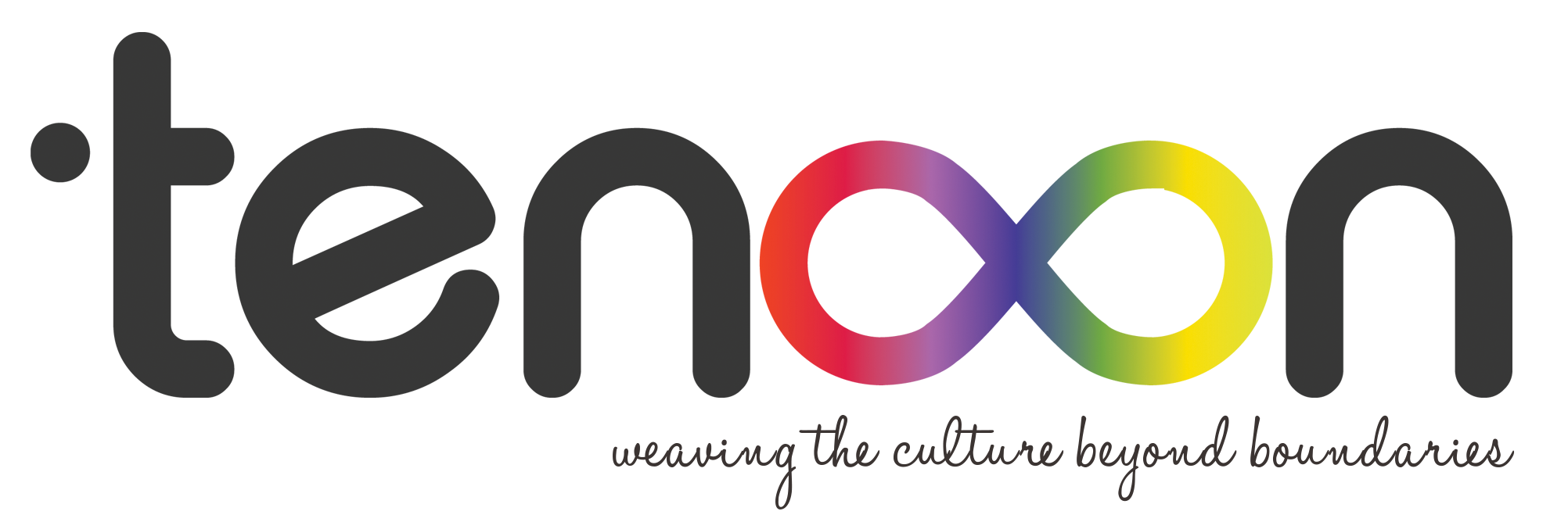
Tenoon wasn’t on our top priority list, but apparently, we got the idea to create the logo with an infinity symbol. Not only as a replacement of double “oo” letter, but we also hoping that Tenoon can be a limitless platform to create something positively. Therefore we agreed with Tenoon name with double “oo” which we illustrate with an infinity symbol.
So we had a name, we had the idea of the logo. But, it doesn’t mean the process would be easier. Making a logo means creating an identity. We don’t want our identity to be a random image or interesting symbol from the internet or just a common word with some typography. So we look for help from those who has the experience in designing logos. It wasn’t an easy task because we were looking for those who are willing to help us voluntarily (pro bono). Without the logo, our pilot product development process would get slower because we need the fixed logo to be embedded on our product.
We “met” this Gilang Bagus Batara by fate, a young professional designer in graphic design industry. Gilang offered his help, for free, for a whole month, to any startup or SMEs in Indonesia who wants to create their logo, thank God, just what we needed at that time.
After several discussions and revisions which took longer than we expected, our logo was born, Tenoon.
This logo is not only a symbol of Our Identity, but there’s a meaning behind it. Start with the dot, which is part of the letter “t”. It means collaboration, connecting the dots, which would be transformed into Infinity. We hope Tenoon can connect every dot for a limitless positive collaboration.
The color selection for the infinity symbol is a representation of several aspects. From the diversity itself in Indonesia, the people behind this project who came from different background, and of course the rich color of woven fabric in Indonesia. Tenoon has the vision to be an inclusive platform, that’s why our colorful infinity symbol is also an invitation for anyone who wants to collaborate.
For the font, we use rounded characters, to show that Tenoon is flexible and there’s a plenty room to develop.
Not much different with names and logo, our tagline also went through a deep discussion process. “Weaving the culture beyond boundaries”. We wish through Tenoon, we can participate in maintaining the threads of culture that’s supposed to be preserved. But not just weaving, we want Tenoon to involve everyone, including those disadvantaged and/or anyone,’s experiencing “inequality” in employment, that’s why we chose “beyond boundaries,” so we can all develop positively beyond the boundaries.
Regards,
Tenoon


